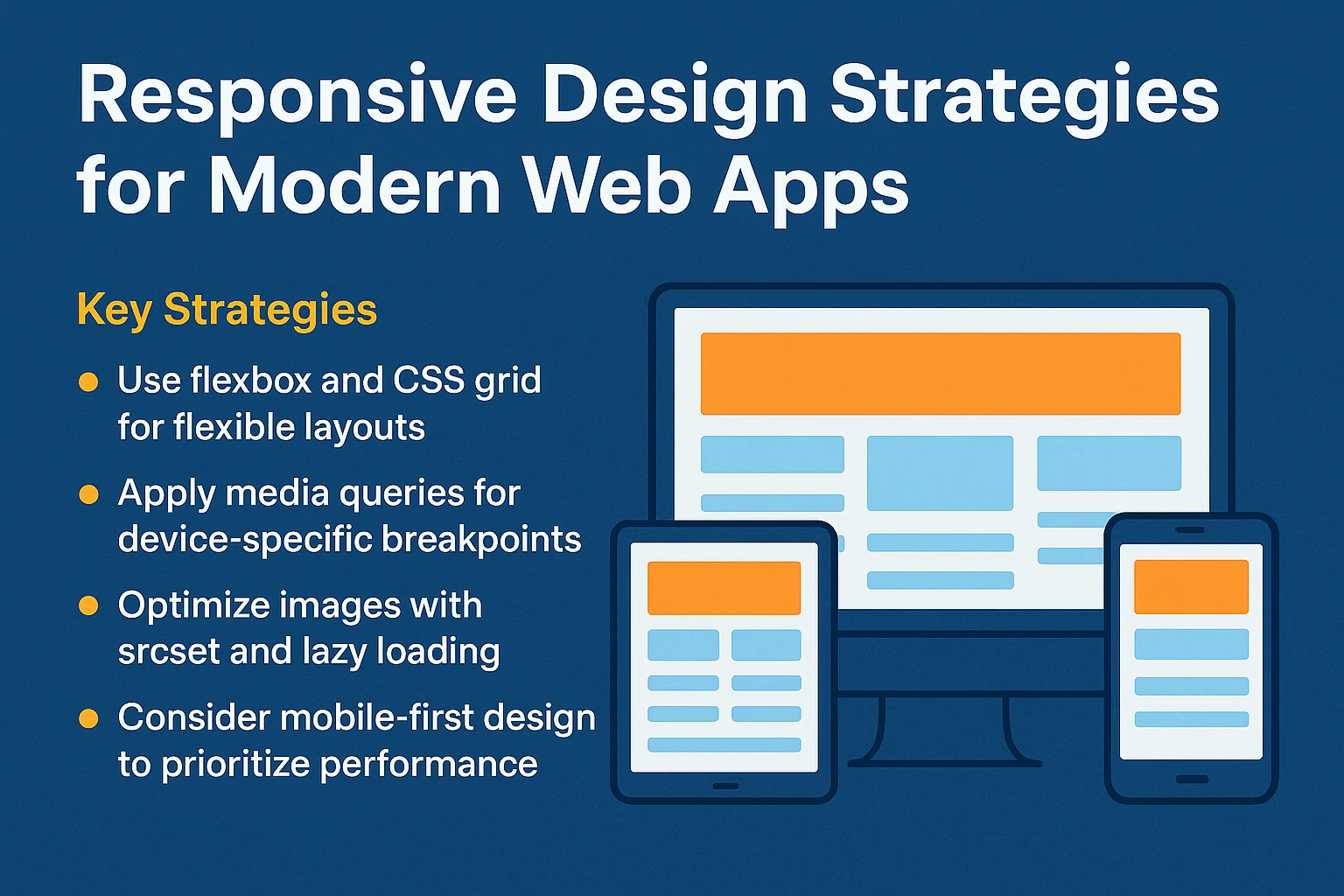
Responsive Design Strategies for Modern Web Apps
Modern web applications must deliver seamless experiences across an enormous spectrum of hardware: from ultra-compact smartphones and smart wearables to high-resolution 4K desktop workstations and dual-screen foldables.
Relying exclusively on rigid pixel breakpoints is no longer sufficient. Modern responsive architecture embraces fluid typography, adaptive layout primitives, and component-level container queries.
📘 Table of Contents
- Mobile-First Architecture Philosophy
- Fluid Typography & Dynamic Spacing with
clamp() - CSS Grid vs. Flexbox: Architectural Selection Rules
- The Game Changer: CSS Container Queries (
@container) - Touch Target Sizing & Accessibility Standards
- FAQ
📐 Fluid Typography with CSS Clamp
Instead of declaring multiple media queries to adjust font size across viewports, modern CSS uses clamp():
/* clamp(MIN, VAL, MAX) */
h1 {
  font-size: clamp(1.75rem, 4vw + 1rem, 3.5rem);
}
This provides completely fluid scaling across all screen dimensions without abrupt layout jumps.
Advanced Responsive Layout Techniques
Modern responsive web design moves beyond basic screen width queries to build genuinely fluid, adaptive component architectures.
1. Fluid Typography with CSS Clamp
Eliminate rigid font size breakpoints using the CSS clamp() function:
/* clamp(min, preferred, max) */
h1 {
  font-size: clamp(1.75rem, 3.5vw + 1rem, 3.5rem);
  line-height: 1.2;
}
2. Component-Level Container Queries
CSS Container Queries (@container) allow components to style themselves based on the width of their immediate parent container rather than the global browser viewport:
.card-wrapper {
  container-type: inline-size;
}

@container (min-width: 480px) {
  .card {
    display: grid;
    grid-template-columns: 1fr 2fr;
  }
}
3. Touch Target Guidelines
Ensure all interactive buttons, links, and form fields provide a minimum touch target of 44x44 CSS pixels with adequate spacing to prevent accidental mobile taps.